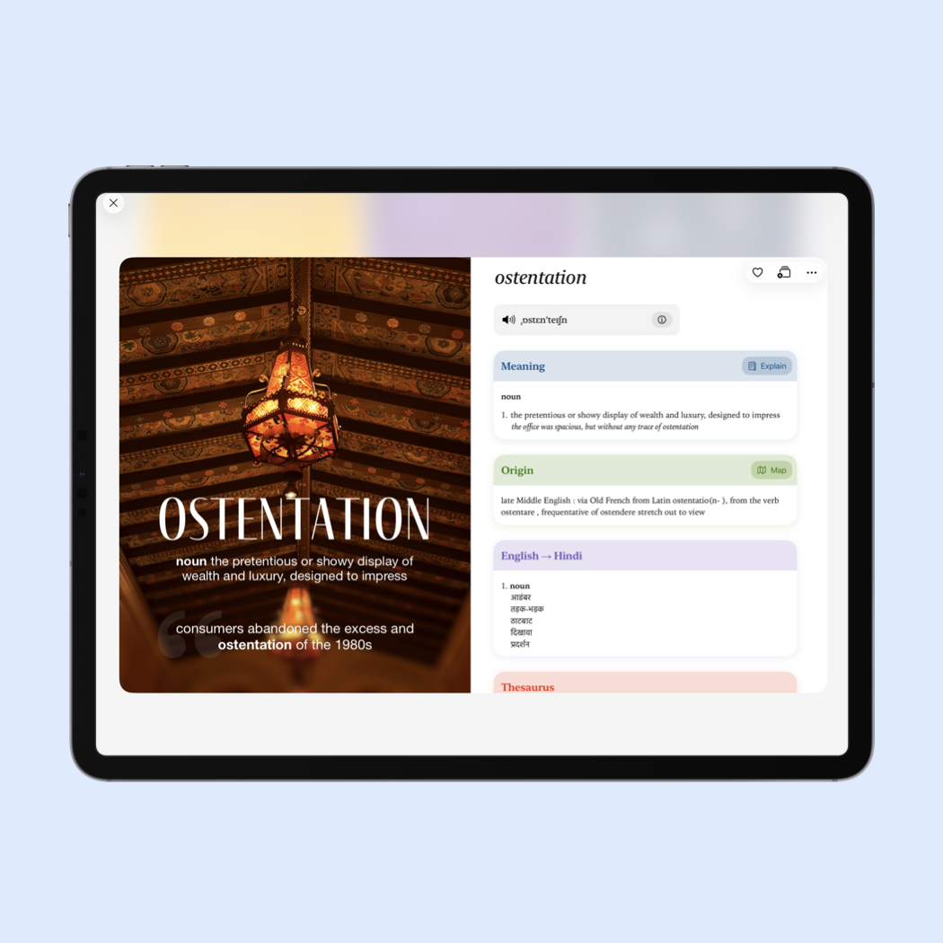
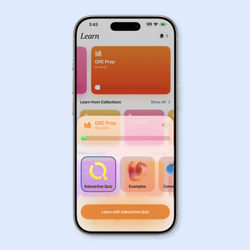
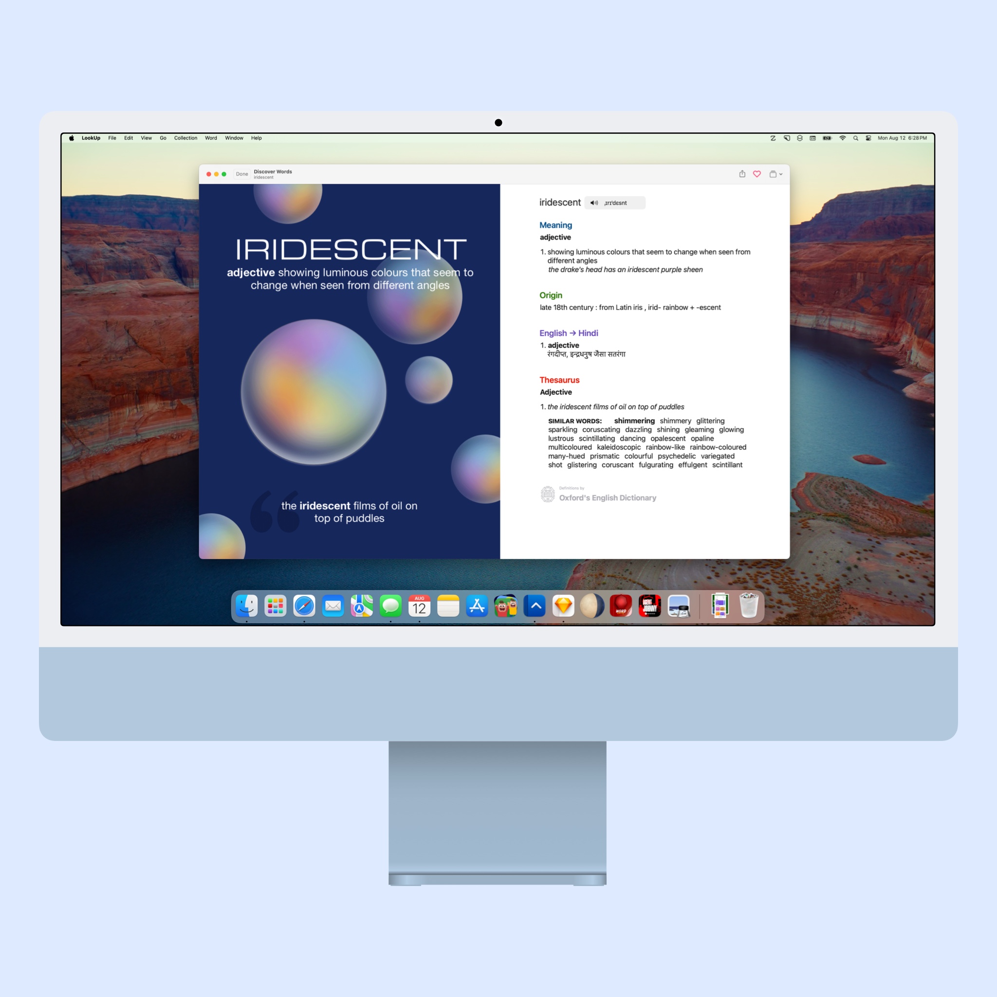
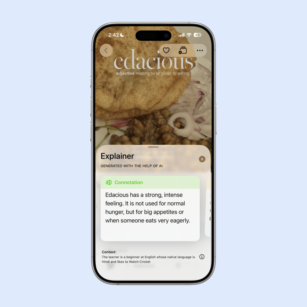
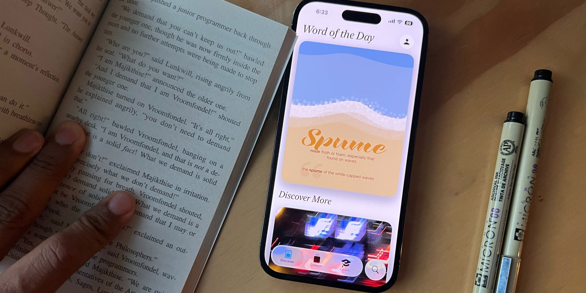
Combined with beautifully illustrated Word of the Day images and rich definitions, LookUp offers a unique and fun way of learning words for non-native English speakers.
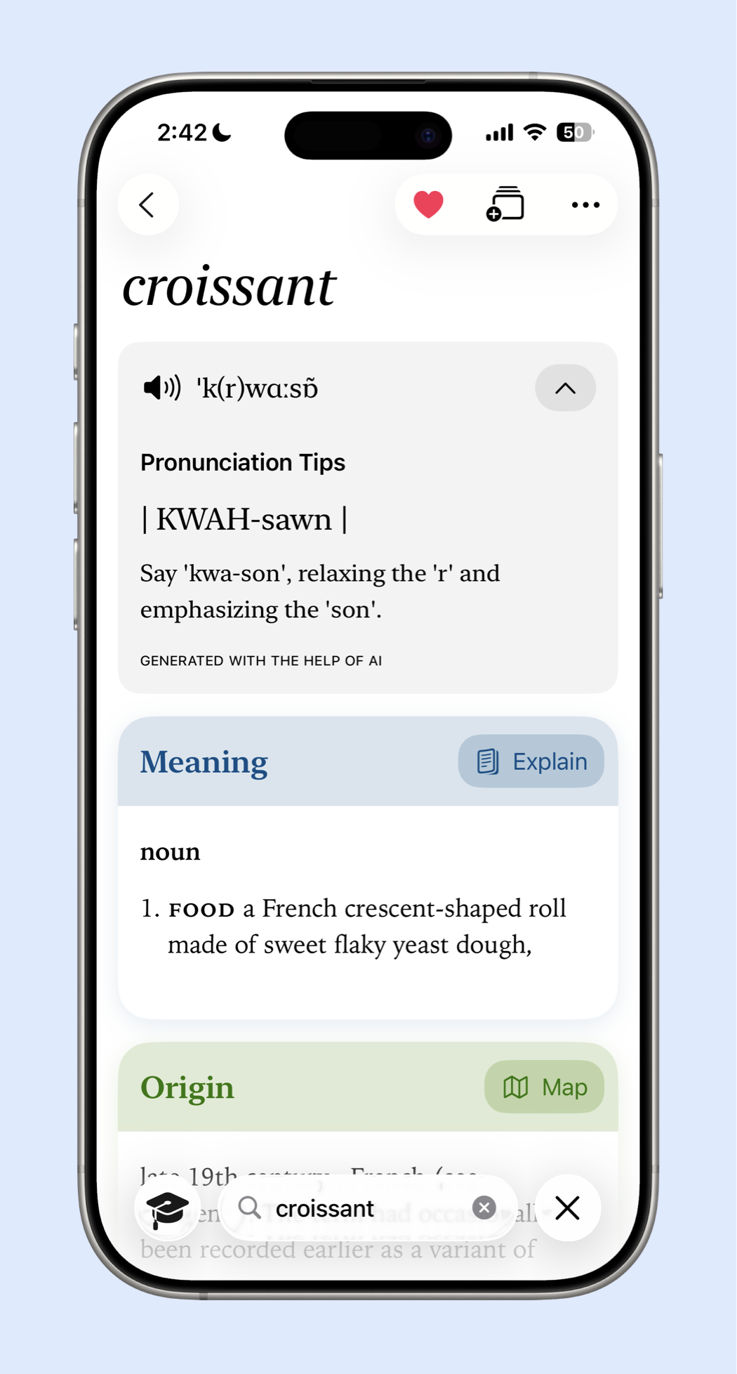
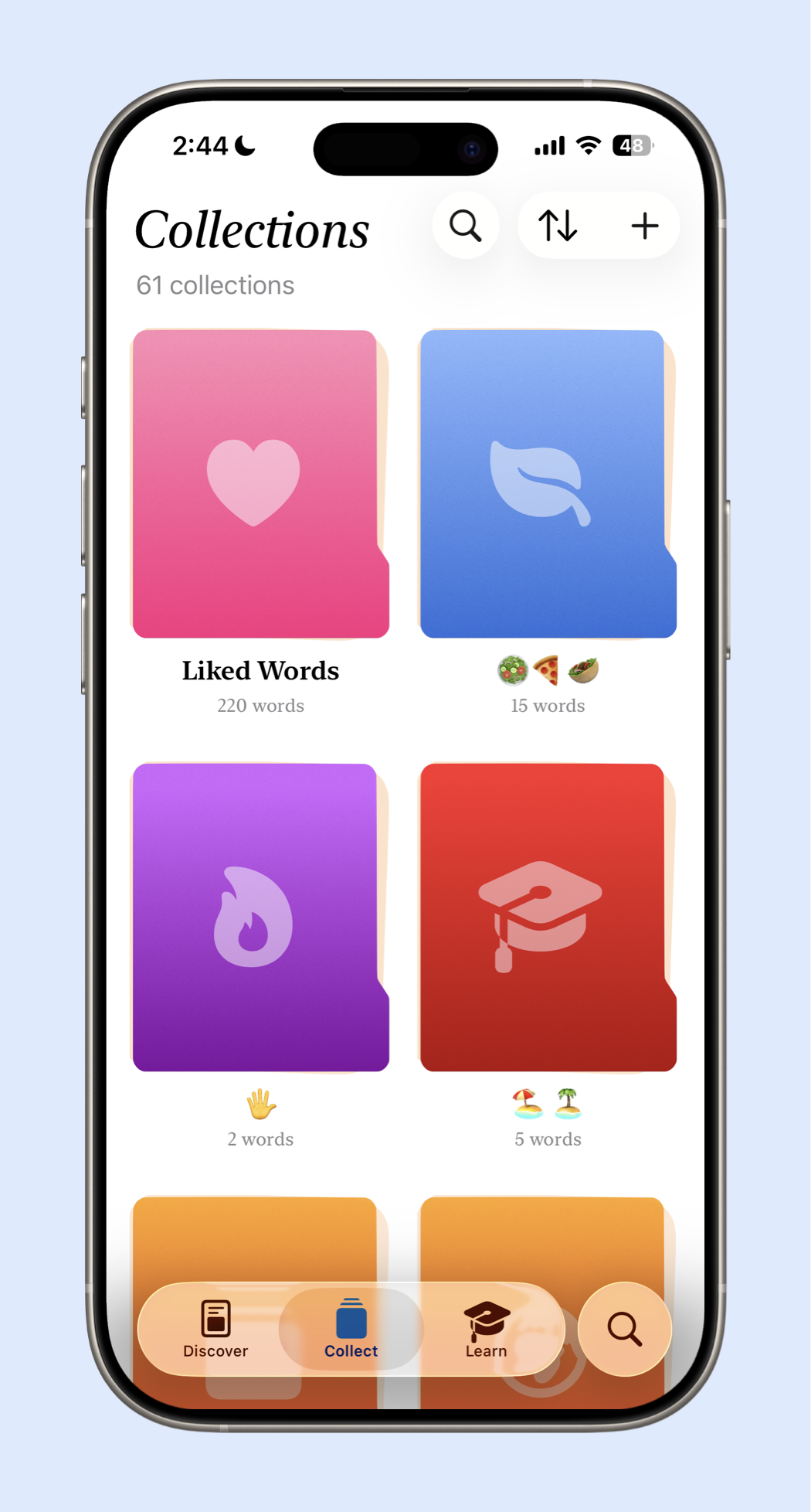
Apart from providing an extensive definition for each dictionary word. LookUp lets users add words into different collections, allowing them to be revised later, so that users can stay on track for learning new words.
Word of the Day
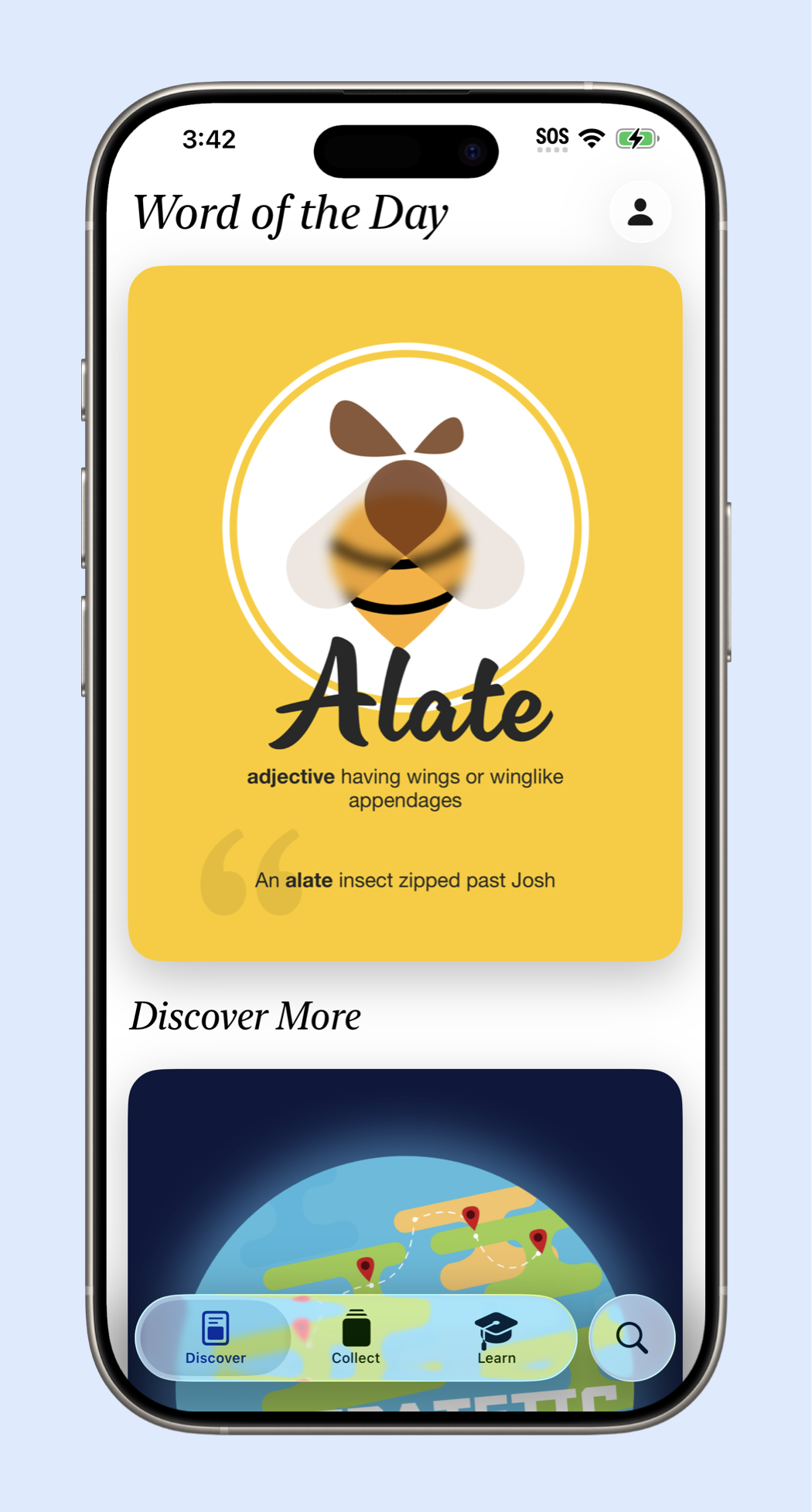
Visuals have a much bigger impact on people’s memory than large blocks of text. Having a visual association with words makes people remember words more easily than viewing large chunks of text.
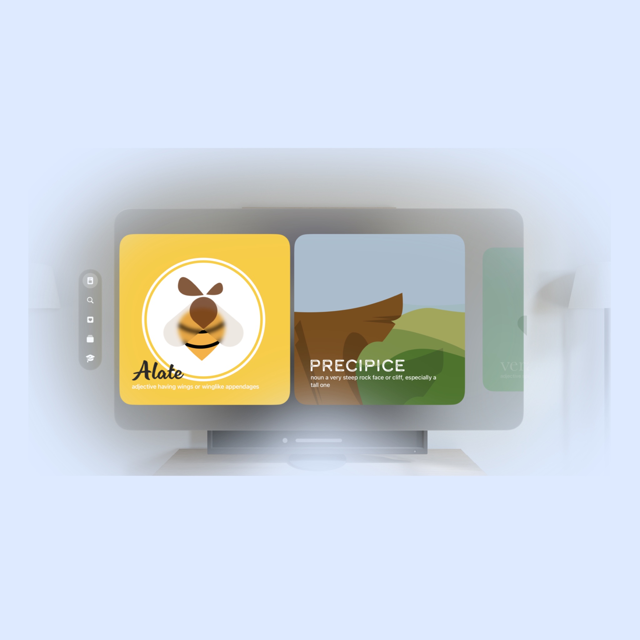
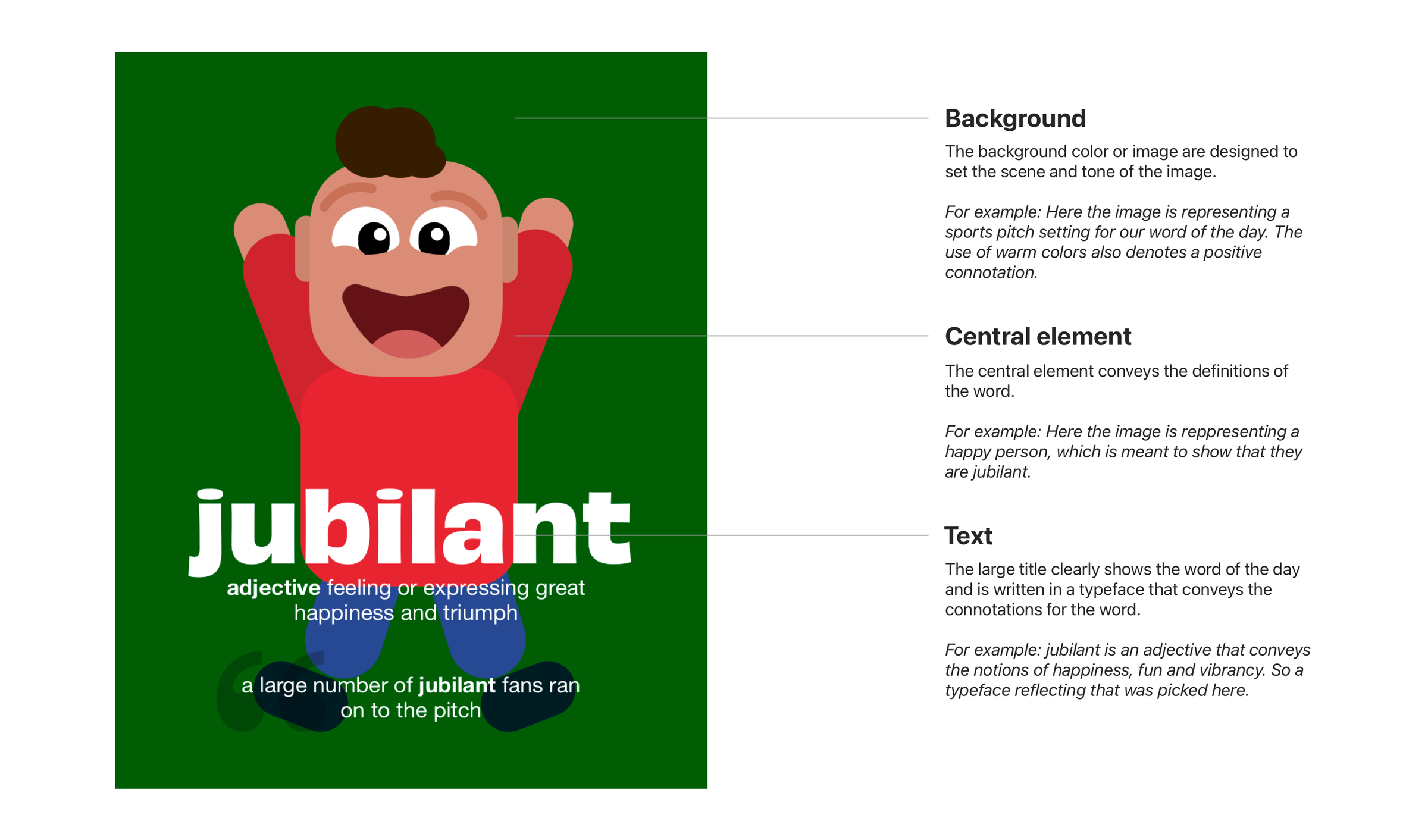
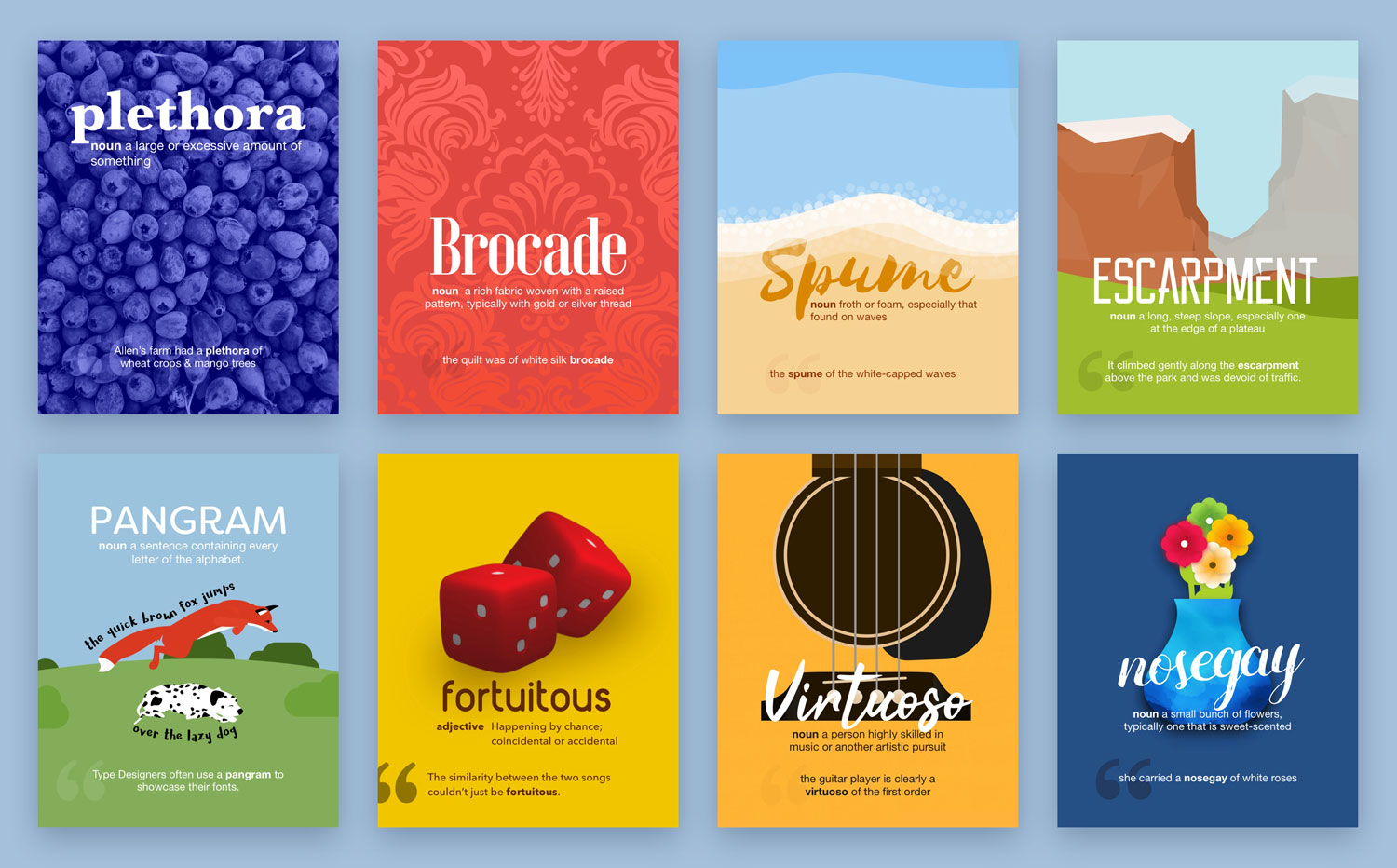
In LookUp, Word of the Day makes the vocabulary building process more visual, easier and more fun; than the traditional cramming of the dictionary. Each word of the day is accompanied by an illustration. The illustrations provide a quick and easy to understand explanation for the word. They’re also accompanied by a short definition and an example usage of the word.
Type can greatly affect the tone of any word. Notice how each one of these Word of the Day shots have different type with each conveying different connotations. Right type can make it easier to understand the word
Design Process
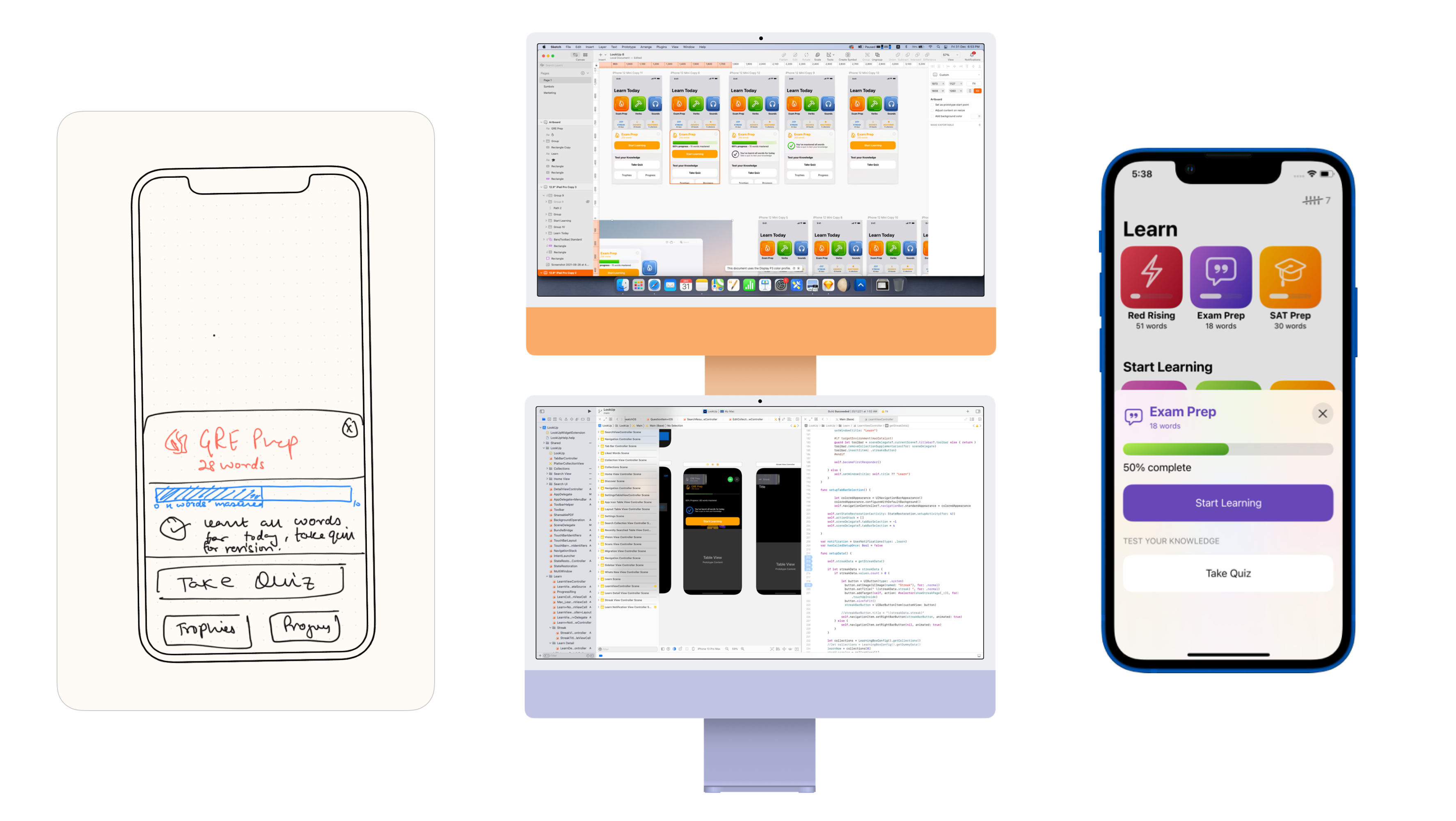
Each design begins on paper, then to Sketch for hi-fidelity mockups and then to Xcode
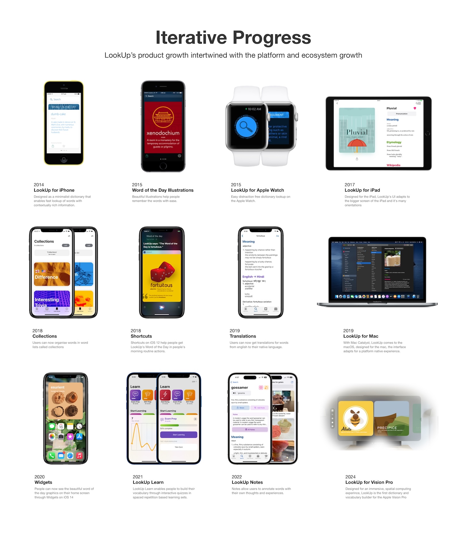
Iterative Design Process
One of the most important parts of LookUp's design process is how it's been designed iteratively over the years. It's not a result of a single shot at product development, rather the product has grown, taking user feedback into account over a span of 10 years.
Digging Deeper into the Design
It’s important to design things carefully. It’s not just about following the Human Interface Guidelines. It’s also about creating something meaningful and something that helps people.
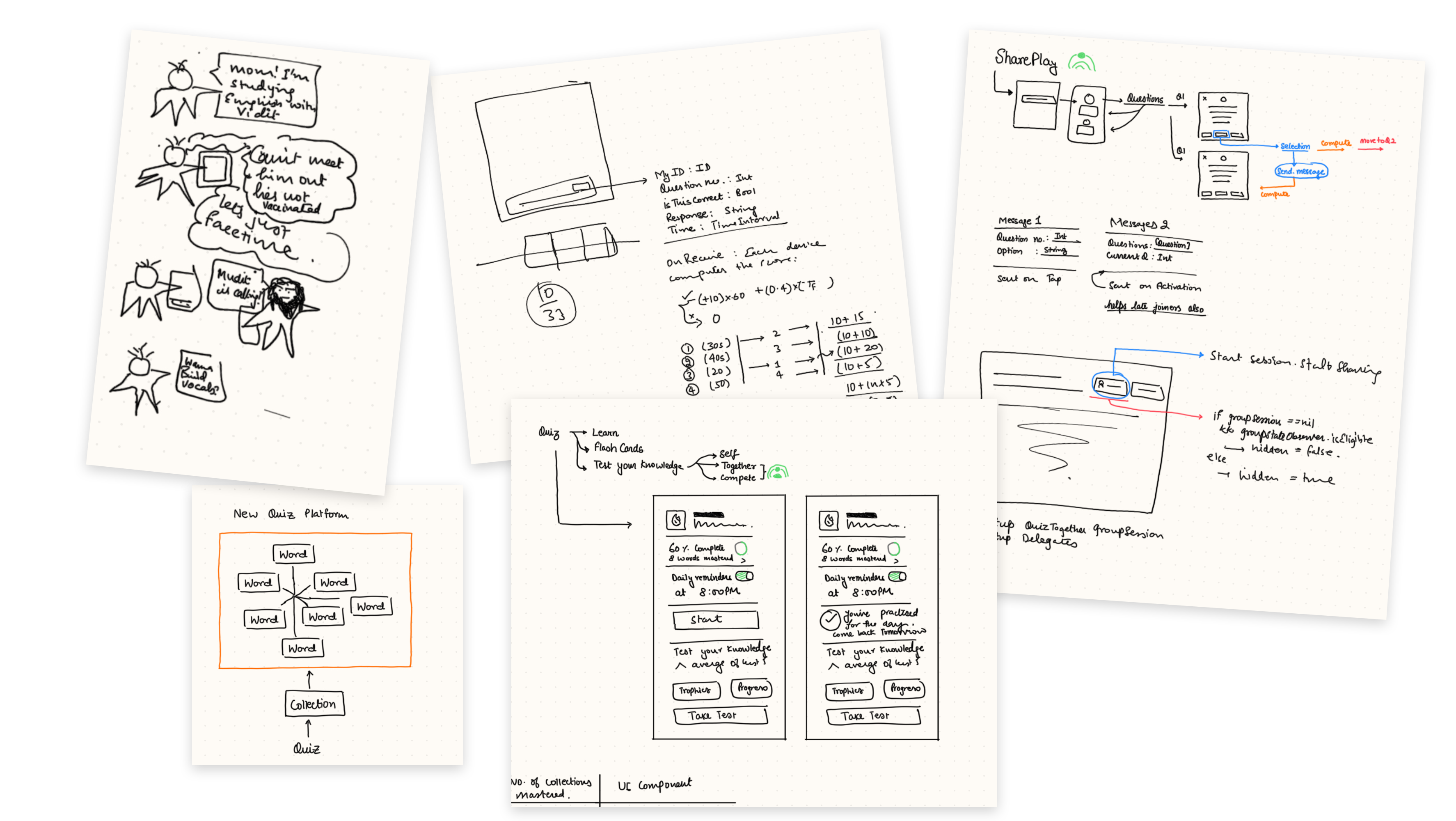
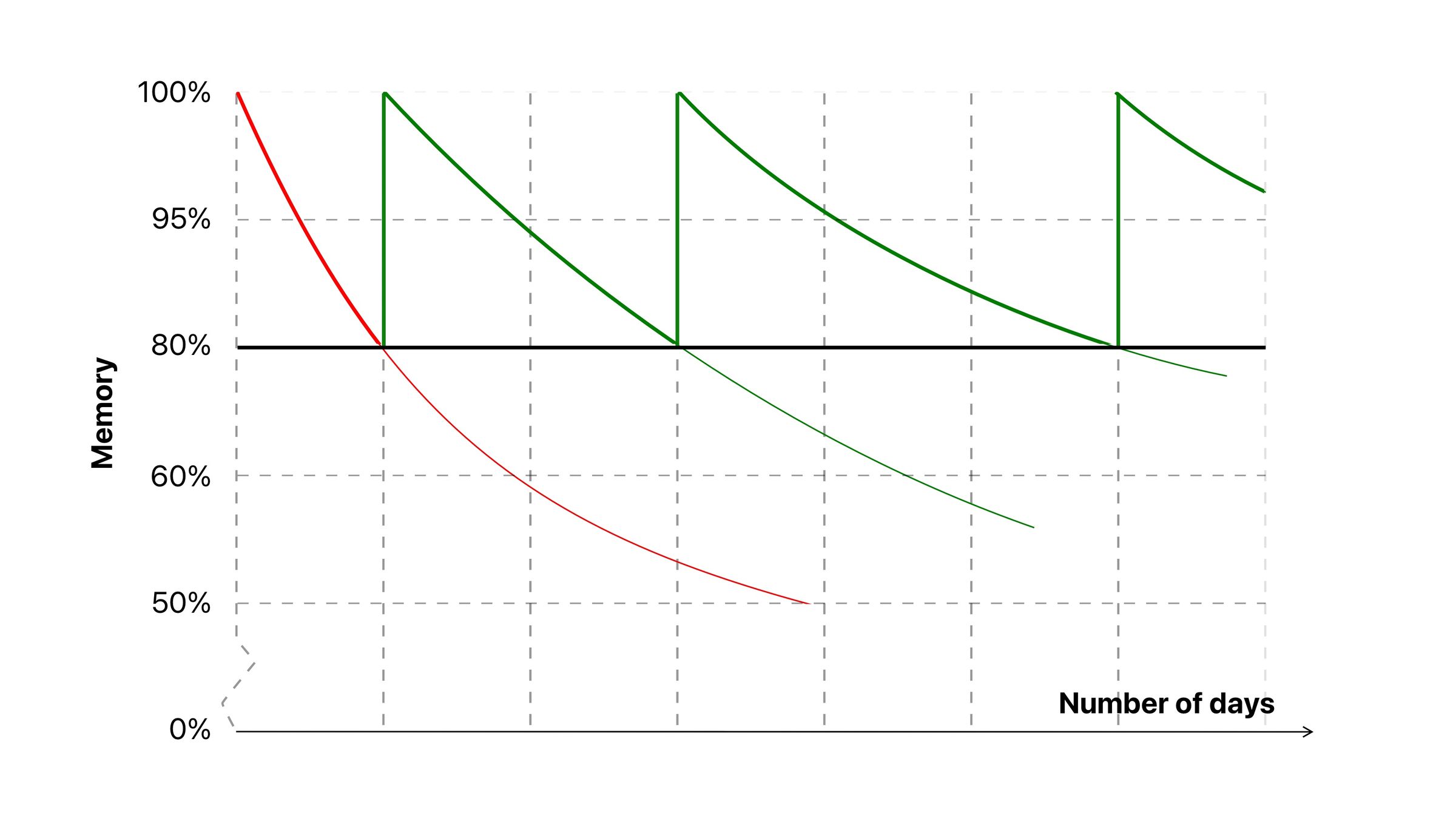
When I designed the Learn features in LookUp, a lot of time went into researching learning techniques, and how people build their vocabulary.
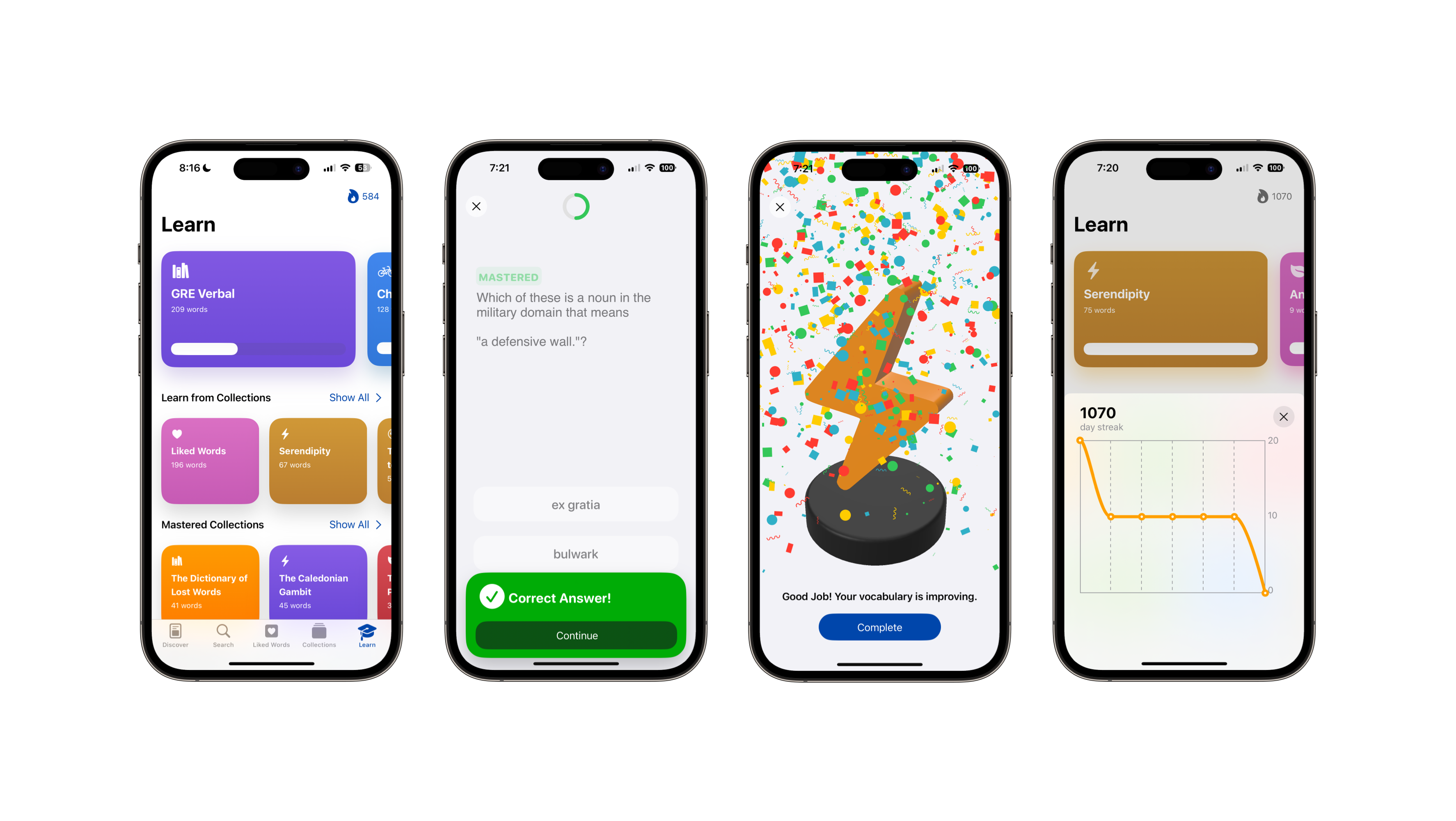
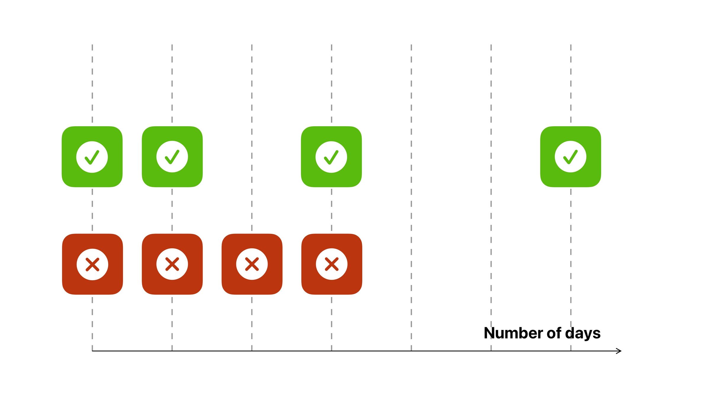
LookUp Learn's Redesign is based on Spaced Repetition Techniques
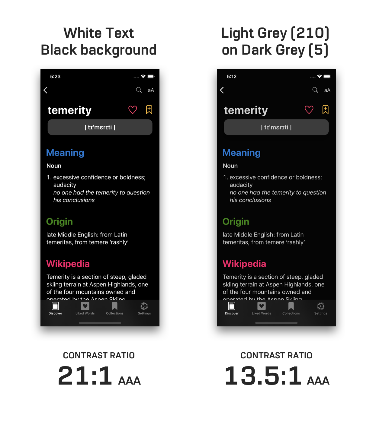
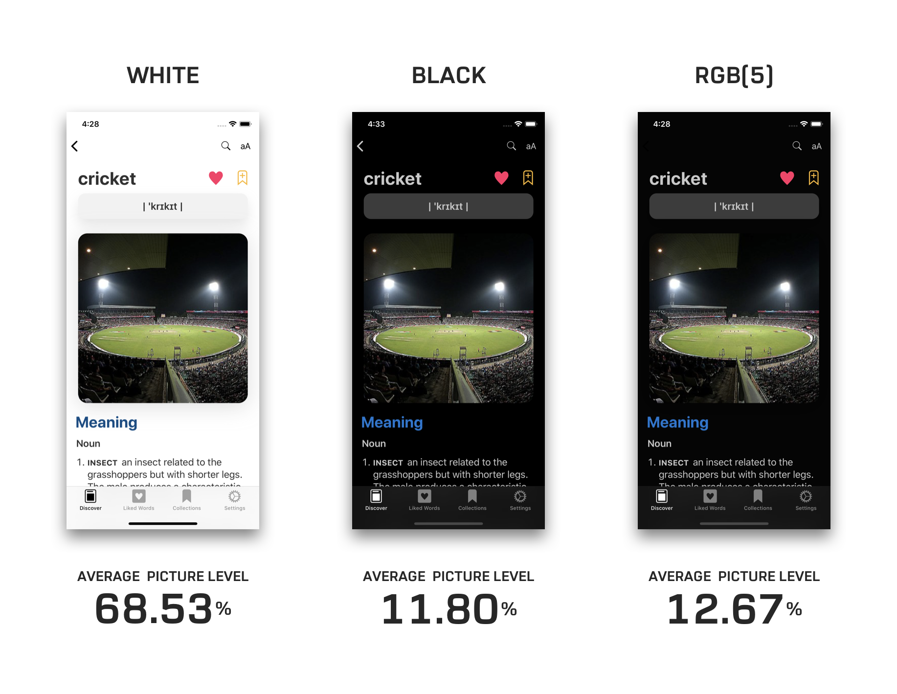
When designing the dark mode for LookUp. I also researched about creating a reader friendly dark mode that’s also accessible, rather than just creating a dark version of the elements.
We often talk about the minimum contrast ratio, but there's a maximum ideal contrast ratio as well. Especially for users with astigmatism.
